
Upgraded Dashboard and QMS Control
Change can be daunting, but sometimes change just makes sense.
qmsWrapper has developed a better way to access QMS functionality in qmsWrapper.
It’s a new UI or Dashboard, and QMS Control Tables.
Fear not, the essential underlying function remains unchanged.
How you access the data does.
The new dashboard puts more QMS functionality at your users' fingertips.
First, we introduced Tabs to better focus on what you need to do now, then next.
Second, we added access buttons, so that users can directly access the QMS functions they need.
Six important QMS functions are now grouped by Tabs and accessible by Buttons, these include CAPA, Nonconformities, Training, Change, Feedback, and Supplier management. For example, all CAPA issues, processes, meetings, etc. related to CAPA, can be easily found in the CAPA Tab and accessed by the CAPA button.
The New Dashboard:
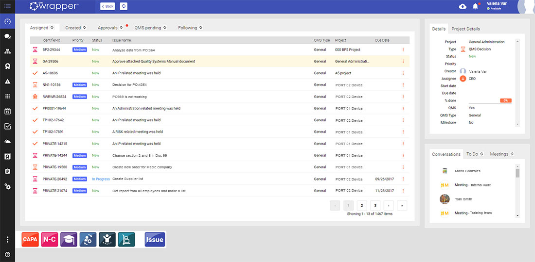
This is the main Dashboard. It contains 5 main Tabs. Issues Assigned to me, Created by me, Approvals (for me, by me and history), QMS pending issues, and Issues I’m following. They should be familiar; they are similar to those in the previous tile Dashboard format but better.
Each tab has a title bar that can be used to sort items.
Click on any item in the Selected Tab, and on the right, a small tab section shows immediate Details, of the task and the Project Details it originates from.
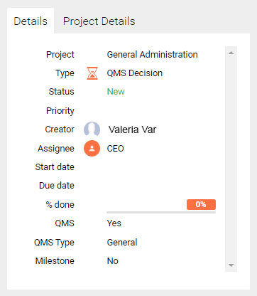
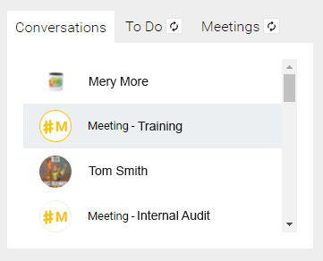
Below, that Tab Section, another section showing recent Conversations, any ToDo items, and any Meetings Pending.

You will also note the familiar black column menu on the left, where users will continue to access projects, documents storage, risk, traceability matrix, settings, and search. (no change here, it was always good).
Note the 3 dot menu added at the button of the Menu bar- that is your new QMS Toolbar.
New: The QMS Toolbar

New is the QMS toolbar for users shows the main QMS functionality, now easily accessible by every user. This puts the QMS functionality within everyone’s reach because QMS is a team sport.
Your data wouldn’t change! Processing it will be easier; for example, select the CAPA button, then the CAPA module appears:
All Issues related to CAPA are presented in that CAPA module (regardless of the project where it was created, where you have permission to access). You can perform all the necessary tasks directly from these modules: from creating CAPA tasks, CAPA meetings, creating or starting CAPA processes, as well as creating custom CAPA issue forms.
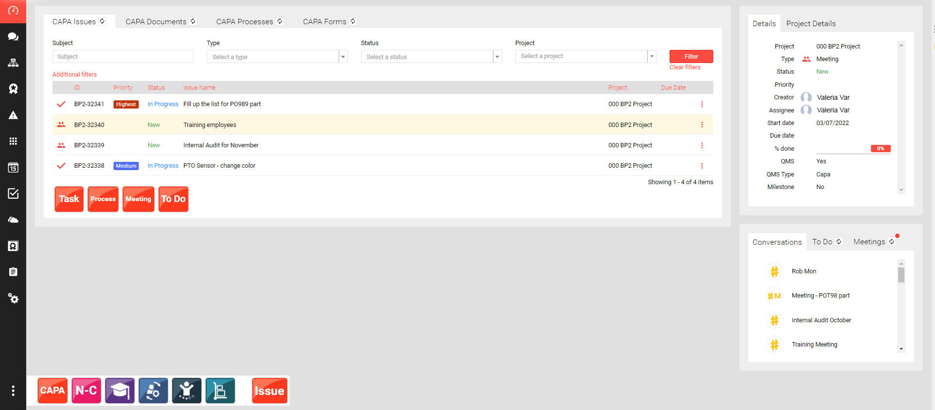
With added filters, processes, tasks, employee efficiency, can be easily tracked.
To create a CAPA issue, press the Task Button. For a process, press the Process Button, etc...
CAPA tabs help you organize the CAPA functionality, showing documents, processes, (started, approved, etc) and CAPA form (custom CAPA forms) started, approved, etc...
Each type of QMS functionality has its own tab section, including Nonconformities, Suppliers, Training, etc...
The differences between the Old version and the New version.
So what are the functional differences between the previous and current version?
Well, datawise nothing. Its only in the presentation.
The 1 limitation is that Tab oriented data is created only using the new DASHBOARD.
For example, CAPA’s created using the previous DASHBOARD will only appear in QMS Issues and will not appear in the CAPA tab.
Nothing is lost, but the very useful CAPA tabs are not involved for older issues still in progress. They can continue to be sorted using the QMS issues tab, but cannot be included in the new CAPA tab.
It’s the same limitation for all the QMS types, including processes.
Basically, the old continues as is, but cannot migrate to the new Tab Dashboard.
As old tasks are completed, and new ones started, the full convenience of the new dashboard will be available to you. But other than a loss of convenience, there is no loss of data or of functionality.
And, you can still choose to use the old dashboard, turning it on and off as you wish by going into your user options and selecting which DASHBOARD to use.
Transition Period – Make it Easy
Of course, some might not be ready for a change at the moment, whether you are in the middle of an audit, or you’re getting ready for an important meeting, we understand: You’ll be allowed to toggle back and forth between the current Version and the new Version 8.0 as you please, just 1 click setting it by yourself in your profile preferences. We’ve made it a long ‘transition’ period where your team can use both environments so you are able to warm up to the new experience over time.
How to set your Dashboard:
Profile Settings/Preferences/Dashboard Settings/Dashboard Version (choose Version 1 or 2)
Version 1 - Old Version
Version 2 - New Version
Validated out of the box! - As per the requirements for a QMS system, this new release has been pre-validated through a full validation cycle. You’ll get all the notes in the Validation Documentation Set. For ISO compliance You can follow our lead or, as required by FDA regulations, you can re-validate for your own intended use.
Treat this as an opportunity to document your validation, or revisit it, and refresh the ink... and the approvals.
We strive to create the best platform for all our users. The new UI delivers on this promise, equipping You and your team with the latest customization and QMS features.
And for all our New Users, we offer 14 days Free Trial: Start your free trial today @ https://store.qmswrapper.com/
Your qmsWrapper Team

Ronyaz Hayyas Mahmood
|
Nice Blog with great topic thanks for extra information